Speedometers Charts in Excel
Well, speedometers are fun. Some people may regard them as “novelty gimmicks”, but with with the right dosage they may bring more life into your presentation and focus the attention of audience where needed. It is more a smart presentation tool, than an analytical instrument.
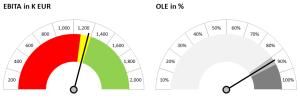
Let’s try to do some in Excel without VBA. Further down you can see two examples. Please note that you can find link to the Excel template at the end of this post.
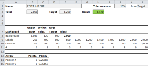
Let’s take the green/yellow/red speedometer for EBITA, as demonstration. The chart is linked to this table:
The grey fields are used to customize the chart. Name will change the caption of the graph, Total will set the maximal value to be displayed in the chart. Target represent the Budget or Forecast. Tolerance is the yellow area between the red (under target) and green area (over target). You can set it also to zero if you wish. It can be set (see cell L1) as % from Target or maximum value (Total).
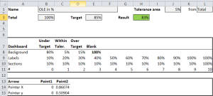
If we reformat the lines 3-10 to percentages and modify respective grey cells, we can follow a percentage indicator like OLE, in the grey chart right. In this case we can not achieve more than 100%, therefore it makes more sense to calculate the tolerance from Total. I changed the color scheme to grey just for illustration purposes (in the template you will find both versions).
How it is done?
Easy. These are stacked 3 different charts over each other. First two are doughnut charts. First refers to the sections in row 10 (and it will also display the labels using line 9), second creates the 3 color background. The last one is an “X,Y chart with lines & markers”, fed from the data in lines 14 & 15 (OK, the last one is a bit complicated). However applying the charts on these areas you will get something like this:
In next steps you rotate the doughnut charts (Format data series/Series option) by 270% so the beginning will be at 9:00 o’clock. Next the data point with the complementary 100% has to be set to “no fill”, so it will become invisible. For the arrow chart we must set for both axis fixed maximum and minimum value of -1,1, to assure that first data point [0,0] will be always in the center. Finally you need to assure that the 2nd data point rotates in circle around the 1st, according the result. Old-fashion trigonometric functions, sin() & cos(), are needed to achieve this. You can examine the formulas in cells C14 & C15 :
In last step we just do more “fancy” formatting. In the Arrow chart applying smart formatting on the line, it will get look close to an actual pointer.
Remove borders where not needed and axis with grid-lines from the Arrow chart. Finally you just stack them over each other. Some size calibration and aligning will be needed to get a visually pleasing result.
Final point. When you wish to organize several speedometer charts into one single dashboard, considering that they consist from multiple charts, the easiest way to do is to use the “camera function” in Excel.
Here is link to the template. Have fun!


